## api
This page documents LegendList APIs for both React Native and React (Web).
Props apply to both React Native and Web unless otherwise noted. Platform-specific notes are called out inline.
## Imports and entrypoints
```ts
// Choose one platform-specific LegendList import
import { LegendList } from "@legendapp/list/react-native";
import { LegendList } from "@legendapp/list/react";
// Optional entrypoints
import { SectionList } from "@legendapp/list/section-list";
import { AnimatedLegendList } from "@legendapp/list/animated";
import { AnimatedLegendList as ReanimatedLegendList } from "@legendapp/list/reanimated";
import { KeyboardAvoidingLegendList } from "@legendapp/list/keyboard";
// Experimental entrypoint
import { KeyboardAvoidingLegendList as KeyboardAvoidingLegendListExperimental } from "@legendapp/list/keyboard-test";
```
The root import (`@legendapp/list`) is still functional (they all share the same JavaScript code), but deprecated for strict typing. Prefer `@legendapp/list/react-native` and `@legendapp/list/react`.
## Required Props
___
LegendList supports two render modes:
- Data mode: `data` + `renderItem`
- Children mode: `children`
When using one mode, the other mode's props should not be provided.
### data
```ts
data: ItemT[];
```
An array of the items to render in data mode. This can also be an array of keys if you want to get the item by key in [renderItem](#renderitem).
### renderItem
```ts
renderItem: (props: { item: ItemT; index: number; extraData: any; type?: string; data: readonly ItemT[] }) => ReactNode;
```
Takes an item from data and renders it into the list in data mode. The `type` parameter is available when using `getItemType`.
See [React Native Docs](https://reactnative.dev/docs/flatlist#renderItem).
### children
```ts
children: ReactNode;
```
Render list items directly as children in children mode (instead of `data`/`renderItem`).
## Recommended Props
___
### keyExtractor
```ts
keyExtractor?: (item: ItemT, index: number) => string;
```
Highly recommended. The `keyExtractor` prop lets Legend List save item layouts by key, so that if the `data` array changes it can reuse previous layout information and only update the changed items. The value it returns should be unique to each item - if a value is reused for a different item it will cause big problems. It is okay to return the index, if list items are reordered or prepended, it will also cause big problems. See [Use key extractor](../performance#use-keyextractor).
If LegendList detects duplicate keys, it will log a warning.
### recycleItems
```ts
recycleItems?: boolean; // default: false
```
This will reuse the component rendered by your `renderItem` function. This can be a big performance improvement, but if your list items have internal state there's potential for undesirable behavior. For more information, see [Performance](../performance#recycling-list-items) for more information.
## Optional Props
___
### alignItemsAtEnd
```ts
alignItemsAtEnd?: boolean; // default: false
```
Aligns to the end of the screen. If there's only a few items, Legend List will add padding to the top to align them to the bottom. See [Chat interfaces](../guides#chat-interfaces) for more.
### alwaysRender
```ts
alwaysRender?: { top?: number; bottom?: number; indices?: number[]; keys?: string[] };
```
Keeps selected items mounted even when they scroll out of view. Use this for pinned items or sentinels. `keys` requires a stable `keyExtractor`.
### columnWrapperStyle
```ts
columnWrapperStyle?: StyleProp;
```
Style applied to each column's wrapper view.
### contentContainerStyle
```ts
contentContainerStyle?: StyleProp;
```
Style applied to the underlying ScrollView's content container.
On web, this maps to the inner content div’s CSS styles.
### contentInset
```ts
contentInset?: { top: number; left: number; bottom: number; right: number };
```
React Native only. Sets ScrollView content insets. On web, prefer padding via `contentContainerStyle` or `style`.
### drawDistance
```ts
drawDistance?: number;
```
The `drawDistance` (defaults to `250`) is the buffer size in pixels above and below the viewport that will be rendered in advance. See [Performance](../performance#set-drawdistance-prop) for more.
### estimatedItemSize
```ts
estimatedItemSize?: number;
```
An estimated size for all items which is used to estimate the list layout before items actually render. This can help to provide a hint for how large items will be in the first frame and can speed up initial layout, but subsequent renders will use the average item size.
### estimatedListSize
```ts
estimatedListSize?: { height: number; width: number };
```
Estimated size of the list viewport used as a first-render hint before actual layout is measured.
### extraData
```ts
extraData?: any;
```
Extra data to trigger re-rendering when changed.
See [React Native Docs](https://reactnative.dev/docs/flatlist#extraData).
### dataVersion
```ts
dataVersion?: Key;
```
Version token that forces the list to treat data as updated even when the array reference is stable. Increment this when mutating `data` in place.
### getEstimatedItemSize
```ts
getEstimatedItemSize?: (item: ItemT, index: number, itemType?: string) => number;
```
An estimated size for each item which is used to estimate the list layout before items actually render.
If omitted, LegendList uses measured averages (and initial `estimatedItemSize`). To log suggestions in development, enable [`suggestEstimatedItemSize`](#suggestestimateditemsize).
### getFixedItemSize
```ts
getFixedItemSize?: (item: ItemT, index: number, itemType?: string) => number | undefined;
```
For items with known fixed sizes, this enables optimal performance as it disables the overhead of measuring and updating item size. Return a number for fixed-size items or undefined for dynamic-size items.
### getItemType
```ts
getItemType?: (item: ItemT, index: number) => string;
```
Allows categorizing different item types for better performance optimization. Items with the same type can be recycled more efficiently.
### horizontal
```ts
horizontal?: boolean; // default: false
```
Renders all items in the list in horizontal.
### useWindowScroll
```ts
useWindowScroll?: boolean; // default: false
```
Web only. When true, LegendList listens to window/body scrolling instead of rendering its own scrollable container.
### initialContainerPoolRatio
```ts
initialContainerPoolRatio?: number; // default: 2
```
Ratio of initial container pool size to data length. The container pool is extra unallocated containers that are used in case the actual size is smaller than the estimated size. This defaults to `2` which we've found to cover most usage. If your items are a fixed size you could set it closer to `1`, or if your items or viewport can resize signficantly it may help to increase it. If the number of containers needed exceeds the pool, LegendList will allocate more containers and re-render the outer list, which may cause a frame stutter.
### initialScrollIndex
```ts
initialScrollIndex?: number | { index: number; viewOffset?: number; viewPosition?: number };
```
Start scrolled with this item at the top (or at the provided `viewPosition`). If item sizes are dynamic, the list will adjust after measurement using the default scroll‑stabilization behavior.
### initialScrollOffset
```ts
initialScrollOffset?: number;
```
Start scrolled to this offset.
### initialScrollAtEnd
```ts
initialScrollAtEnd?: boolean; // default: false
```
When true, the list initializes scrolled to the last item. Overrides `initialScrollIndex` and `initialScrollOffset` when data is available.
### itemsAreEqual
```ts
itemsAreEqual?: (itemPrevious: ItemT, item: ItemT, index: number, data: readonly ItemT[]) => boolean;
```
Optional equality comparator used during data changes to preserve known item sizes and reduce relayout work when items are logically unchanged.
### ItemSeparatorComponent
```ts
ItemSeparatorComponent?: React.ComponentType<{ leadingItem: ItemT }>
```
Rendered in between each item, but not at the top or bottom.
See [React Native Docs](https://reactnative.dev/docs/flatlist#itemseparatorcomponent).
### ListEmptyComponent
```ts
ListEmptyComponent?: React.ComponentType | React.ReactElement | null | undefined;
```
Rendered when the list is empty.
See [React Native Docs](https://reactnative.dev/docs/flatlist#listemptycomponent).
### ListFooterComponent
```ts
ListFooterComponent?: React.ComponentType | React.ReactElement | null | undefined;
```
Rendered at the bottom of all the items.
See [React Native Docs](https://reactnative.dev/docs/flatlist#listfootercomponent).
### ListFooterComponentStyle
```ts
ListFooterComponentStyle?: StyleProp | undefined;
```
Styling for internal View for `ListFooterComponent`.
See [React Native Docs](https://reactnative.dev/docs/flatlist#listfootercomponentstyle).
### ListHeaderComponent
```ts
ListHeaderComponent?: React.ComponentType | React.ReactElement | null | undefined;
```
Rendered at the top of all the items.
See [React Native Docs](https://reactnative.dev/docs/flatlist#listheadercomponent).
### ListHeaderComponentStyle
```ts
ListHeaderComponentStyle?: StyleProp | undefined;
```
Styling for internal View for `ListHeaderComponent`.
See [React Native Docs](https://reactnative.dev/docs/flatlist#listheadercomponentstyle).
### maintainScrollAtEnd
```ts
maintainScrollAtEnd?: boolean | {
onLayout?: boolean;
onItemLayout?: boolean;
onDataChange?: boolean;
};
```
If enabled, LegendList keeps the view pinned to end when you are near the bottom.
- `true`: enables end-maintenance for layout, item-layout, and data updates.
- object form: choose which update types should keep end-position pinned.
See [Chat interfaces](../guides#chat-interfaces) for more.
### maintainScrollAtEndThreshold
```ts
maintainScrollAtEndThreshold?: number;
```
This defines what percent of the screen counts as the bottom. Defaults to `0.1`.
See [Chat interfaces](../guides#chat-interfaces) for more.
### maintainVisibleContentPosition
```ts
maintainVisibleContentPosition?: boolean | {
data?: boolean;
size?: boolean;
shouldRestorePosition?: (item: ItemT, index: number, data: ItemT[]) => boolean;
};
```
Controls how the list stabilizes scroll position when items above the viewport change.
- `size` (default: true): stabilizes during size/layout changes while scrolling
- `data` (default: false): anchors when the data array changes
- `shouldRestorePosition`: return `false` to skip anchoring for specific items
Passing `true` enables both `size` and `data`. Passing `false` disables both.
React Native note: when `data` anchoring is enabled, LegendList uses ScrollView’s [maintainVisibleContentPosition](https://reactnative.dev/docs/scrollview#maintainvisiblecontentposition) under the hood. Android requires React Native 0.72+ for that prop.
### numColumns
```ts
numColumns?: number;
```
Multiple columns will zig-zag like a flexWrap layout. Rows will take the maximum height of their columns, so items should all be the same height - masonry layouts are not supported.
### onEndReached
```ts
onEndReached?: ((info: { distanceFromEnd: number }) => void) | null | undefined;
```
A callback that's called only once when scroll is within `onEndReachedThreshold` of the bottom of the list. It resets when scroll goes above the threshold and then will be called again when scrolling back into the threshold.
### onEndReachedThreshold
```ts
onEndReachedThreshold?: number | null | undefined;
```
The distance from the end as a percentage that the scroll should be from the end to trigger `onEndReached`. It is multiplied by screen size, so a value of 0.5 will trigger `onEndReached` when scrolling to half a screen from the end.
### onItemSizeChanged
```ts
onItemSizeChanged?: (info: {
size: number;
previous: number;
index: number;
itemKey: string;
itemData: ItemT;
}) => void;
```
Called whenever an item's rendered size changes. This can be used to adjust the estimatedItemSize to match the actual size, which can improve performance or reduce layout shifting.
### onMetricsChange
```ts
onMetricsChange?: (metrics: { headerSize: number; footerSize: number }) => void;
```
Called when list layout metrics change (header or footer size updates).
### onLoad
```ts
onLoad?: (info: { elapsedTimeInMs: number }) => void;
```
Called after the list is ready to render. Useful for measuring first render readiness.
### onRefresh
```ts
onRefresh?: () => void;
```
React Native only. Called whenever a user pulls down to refresh. See [React Native Docs](https://reactnative.dev/docs/flatlist#onRefresh).
### onScroll
```ts
onScroll?: (event: NativeSyntheticEvent) => void;
```
Called on scroll events with platform-specific scroll data.
### onStartReached
```ts
onStartReached?: ((info: { distanceFromStart: number }) => void) | null | undefined;
```
A callback that's called only once when scroll is within `onStartReachedThreshold` of the top of the list. It resets when scroll goes above the threshold and then will be called again when scrolling back into the threshold.
### onStartReachedThreshold
```ts
onStartReachedThreshold?: number | null | undefined;
```
The distance from the start as a percentage that the scroll should be from the start to trigger `onStartReached`. It is multiplied by screen size, so a value of 0.5 will trigger `onStartReached` when scrolling to half a screen from the start.
### onStickyHeaderChange
```ts
onStickyHeaderChange?: (info: { index: number; item: any }) => void;
```
Called when the active sticky header changes.
### overrideItemLayout
```ts
overrideItemLayout?: (
layout: { span?: number },
item: ItemT,
index: number,
maxColumns: number,
extraData?: any
) => void;
```
Customize multi-column item layout (for example, setting `span`) before positions are computed.
### onViewableItemsChanged
```ts
onViewableItemsChanged?: OnViewableItemsChanged | undefined;
```
Called when the viewability of rows changes, as defined by the `viewabilityConfig` prop.
See [React Native Docs](https://reactnative.dev/docs/flatlist#onviewableitemschanged).
### progressViewOffset
```ts
progressViewOffset?: number | undefined;
```
React Native only. Offset in pixels for the refresh indicator.
### ref
```ts
ref?: LegendListRef;
```
Used to call `scrollTo` [methods](#ref-methods).
### refreshing
```ts
refreshing?: boolean;
```
React Native only. Set this true while waiting for new data from a refresh.
See [React Native Docs](https://reactnative.dev/docs/flatlist#refreshing).
### refScrollView
```ts
refScrollView?: React.Ref;
```
Ref to the underlying scroll container instance.
### renderScrollComponent
```ts
renderScrollComponent?: (props: ScrollViewProps) => ReactElement | null
```
Render a custom scroll component. On React Native this is typically a `ScrollView`; on web this is the underlying DOM scroll element wrapper.
On React Native, when using `stickyHeaderIndices`, provide an Animated-capable scroll component.
Note that passing `renderScrollComponent` as an inline function might cause you to lose scroll position if the list is rerendered.
```tsx
renderScrollComponent={(props) => }
```
Instead, it's better to extract it as a custom component.
```tsx
const CustomScrollView = (props: ScrollViewProps) => {
return ;
};
```
### snapToIndices
```ts
snapToIndices?: number[];
```
An array of indices that the scroll position can snap to. When scrolling stops near one of these indices, the scroll position will automatically adjust to align with that item.
### stickyHeaderIndices
```ts
stickyHeaderIndices?: number[];
```
An array of indices for items that should stick to the top of the list while scrolling. Sticky headers remain visible at the top of the viewport as you scroll past them.
Not supported with `horizontal={true}`.
### stickyIndices (deprecated)
```ts
stickyIndices?: number[];
```
Deprecated alias for `stickyHeaderIndices`.
### stickyHeaderConfig
```ts
stickyHeaderConfig?: {
offset?: number;
backdropComponent?: React.ComponentType | React.ReactElement | null | undefined;
};
```
Configures sticky header behavior:
- `offset`: sticky top offset (for fixed toolbars/navbars)
- `backdropComponent`: optional backdrop rendered behind sticky header
### style
```ts
style?: StyleProp;
```
Style applied to the underlying ScrollView. On web this maps to the scroll container’s CSS style.
### suggestEstimatedItemSize
```ts
suggestEstimatedItemSize?: boolean;
```
When enabled in development, LegendList logs suggested `estimatedItemSize` values based on measured items.
### viewabilityConfig
```ts
viewabilityConfig?: ViewabilityConfig;
```
Configuration for when to update the `onViewableItemsChanged` callback.
See [React Native Docs](https://reactnative.dev/docs/flatlist#viewabilityconfig).
### viewabilityConfigCallbackPairs
```ts
viewabilityConfigCallbackPairs?: ViewabilityConfigCallbackPairs | undefined;
```
List of `ViewabilityConfig`/`onViewableItemsChanged` pairs. A specific `onViewableItemsChanged` will be called when its corresponding `ViewabilityConfig`'s conditions are met.
See [React Native Docs](https://reactnative.dev/docs/flatlist#viewabilityconfigcallbackpairs).
### waitForInitialLayout
```ts
waitForInitialLayout?: boolean; // default true
```
If true, delays rendering until initial layout is complete
## SectionList
Legend List ships a SectionList-compatible component built on the same virtualization core.
```tsx
import { SectionList } from "@legendapp/list/section-list";
```
### Quick example
```tsx
import { Text } from "react-native";
import { SectionList } from "@legendapp/list/section-list";
const sections = [
{ title: "A", data: ["Apple", "Avocado"] },
{ title: "B", data: ["Banana", "Blueberry"] },
];
const Header = ({ title }: { title: string }) => {title};
const Row = ({ label }: { label: string }) => {label};
export function MySectionList() {
return (
item}
renderSectionHeader={({ section }) => }
renderItem={({ item }) => |
}
stickySectionHeadersEnabled
estimatedItemSize={48}
/>
);
}
```
### Behavior and API
- Mirrors React Native `SectionList` props: `sections`, `renderSectionHeader`, `renderSectionFooter`, separators, `stickySectionHeadersEnabled`, and `scrollToLocation`.
- Accepts shared LegendList performance props like `recycleItems`, `maintainScrollAtEnd`, and `drawDistance`.
- Manages `stickyHeaderIndices` internally.
### scrollToLocation
```ts
ref.current?.scrollToLocation({
sectionIndex: 2,
itemIndex: 10,
viewPosition: 0,
viewOffset: 12,
animated: true,
});
```
### Limitations
- `horizontal` disables sticky section headers.
- `numColumns` and `columnWrapperStyle` are not supported (SectionList is always one column).
- `stickyHeaderIndices` is managed internally.
## Ref Methods
___
### getState
```ts
getState(): LegendListState;
```
Returns a live snapshot API for advanced integrations. See [getState()](#getstate-details) for the full type, fields, listener channels, caveats, and examples.
### clearCaches
```ts
clearCaches(options?: { mode?: "sizes" | "full" }): void;
```
Clears internal virtualization caches.
- `sizes` (default): clears size/average caches and recalculates item positions.
- `full`: also clears key/index/position caches.
Useful if you know cached measurements are stale after major data/layout changes.
### flashScrollIndicators
```ts
flashScrollIndicators(): void;
```
Asks the underlying scroll component to briefly show its scroll indicators.
### getNativeScrollRef
```ts
getNativeScrollRef(): any;
```
Returns the underlying scroll instance (platform-specific type).
### getScrollableNode
```ts
getScrollableNode(): any;
```
Returns the underlying native/DOM node used for scrolling.
### getScrollResponder
```ts
getScrollResponder(): any;
```
Returns the platform scroll responder object for advanced integrations.
### scrollToIndex
```ts
scrollToIndex(params: {
index: number;
animated?: boolean;
viewOffset?: number;
viewPosition?: number;
}): Promise;
```
Scrolls to the item at the specified index. For the most accurate results, provide good size estimates via [getEstimatedItemSize](#getestimateditemsize) or [getFixedItemSize](#getfixeditemsize). Size stabilization is enabled by default for dynamic items.
Returns a promise that resolves when the imperative scroll finishes (or immediately if no scroll was needed).
### scrollToOffset
```ts
scrollToOffset(params: {
offset: number;
animated?: boolean;
}): Promise;
```
Scroll to a specific content pixel offset in the list.
Valid parameters:
- *offset* (number) - The offset to scroll to. In case of horizontal being true, the offset is the x-value, in any other case the offset is the y-value. Required.
- *animated* (boolean) - Whether the list should do an animation while scrolling. Defaults to true.
### scrollToItem
```ts
scrollToItem(params: {
animated?: boolean,
item: Item,
viewOffset?: number;
viewPosition?: number;
}): Promise;
```
Requires linear scan through data - use [scrollToIndex](#scrolltoindex) instead if possible. Provided for compatibility with FlatList only.
Valid parameters:
- *animated* (boolean) - Whether the list should do an animation while scrolling. Defaults to true.
- *item* (object) - The item to scroll to. Required.
### scrollToEnd
```ts
scrollToEnd(params?: {
animated?: boolean,
viewOffset?: number,
}): Promise;
```
Scrolls to the end of the list.
Valid parameters:
- *animated* (boolean) - Whether the list should do an animation while scrolling. Defaults to true.
### scrollIndexIntoView
Scrolls the index into view. If the index is above the viewable range it will be scrolled to the top of the screen, and if it's below the viewable range it will be scrolled to the bottom of the screen.
```ts
scrollIndexIntoView(params: {
animated?: boolean | undefined;
index: number;
}): Promise
```
```jsx
import { useRef } from "react";
import { Button } from "react-native";
import { LegendList } from "@legendapp/list/react-native";
export function ScrollExample() {
const listRef = useRef(null);
const scrollToItem = () => {
// Scroll to the item at index 10
listRef.current?.scrollIndexIntoView({ index: 10 });
};
return (
<>
);
}
```
### scrollItemIntoView
Scrolls the item into view. If the item is above the viewable range it will be scrolled to the top of the screen, and if it's below the viewable range it will be scrolled to the bottom of the screen.
```ts
scrollItemIntoView(params: {
animated?: boolean | undefined;
item: any;
}): Promise;
```
```jsx
import { useRef } from "react";
import { Button } from "react-native";
import { LegendList } from "@legendapp/list/react-native";
export function ScrollToItemExample() {
const listRef = useRef(null);
const targetItem = { id: "item-5", text: "Target Item" };
const scrollToSpecificItem = () => {
// Scroll to the item that matches targetItem
listRef.current?.scrollItemIntoView({ item: targetItem });
};
return (
<>
);
}
```
### setVisibleContentAnchorOffset
```ts
setVisibleContentAnchorOffset(value: number | ((current: number) => number)): void;
```
Adjusts the internal anchor offset used by `maintainVisibleContentPosition`. Useful for advanced scroll anchoring behavior.
### setScrollProcessingEnabled
```ts
setScrollProcessingEnabled(enabled: boolean): void;
```
Enables or disables scroll processing. Useful when you need to temporarily opt out of list virtualization behavior.
### reportContentInset
```ts
reportContentInset(inset?: { top?: number; left?: number; bottom?: number; right?: number } | null): void;
```
Reports an externally measured content inset (merged with props/native insets). Pass `null`/`undefined` to clear.
## Hooks
Hooks are exported from both `@legendapp/list/react-native` and `@legendapp/list/react`.
### useRecyclingState
```ts
interface LegendListRecyclingState {
item: T;
prevItem: T | undefined;
index: number;
prevIndex: number | undefined;
}
useRecyclingState: (
updateState: ((info: LegendListRecyclingState) => T) | T
) => [T, Dispatch>];
```
`useRecyclingState` automatically resets the state when an item is recycled into a new item.
```tsx
import { useRecyclingState } from "@legendapp/list/react-native"
export function ItemComponent({ item }) {
// Like useState but it resets when the item is recycled
const [isExpanded, setIsExpanded] = useRecyclingState(() => false);
// ...
}
```
### useIsLastItem
```ts
useIsLastItem: () => boolean;
```
Returns `true` when the current rendered item is one of the list's last items.
Useful for conditional spacing, CTA rows, or end-of-list UI logic.
### useListScrollSize
```ts
useListScrollSize: () => { width: number; height: number };
```
Returns the current scroll viewport size for the parent list.
Useful when item rendering depends on viewport dimensions.
### useRecyclingEffect
```ts
interface LegendListRecyclingState {
item: T;
prevItem: T | undefined;
index: number;
prevIndex: number | undefined;
}
useRecyclingEffect: (effect: (info: LegendListRecyclingState) => void | (() => void)) => void;
```
`useRecyclingEffect` can be used to reset any side effects when an item gets recycled.
```tsx
import { useRef } from "react";
import { useRecyclingEffect } from "@legendapp/list/react-native"
export function ItemComponent({ item }) {
const refSwipeable = useRef(null);
const refVideo = useRef(null);
// A callback when the item is recycled into a new item
useRecyclingEffect(({ item, prevItem, index, prevIndex }) => {
// Reset any side effects from the previous item
refSwipeable?.current?.close();
refVideo?.current?.reset();
});
// ...
}
```
### useViewability
```ts
interface ViewToken {
containerId: number;
index: number;
isViewable: boolean;
item: ItemT;
key: string;
}
useViewability: (callback: (viewToken: ViewToken) => void, configId?: string) => void;
```
A hook that provides callbacks when an item's viewability changes. This hook registers a callback that will be invoked whenever the item's visibility status changes, providing detailed information about the item through the ViewToken interface. It is similar to [onViewableItemsChanged](#onviewableitemschanged) but runs for only the rendering item. If you defined multiple viewability configs using [viewabilityConfigCallbackPairs](#viewabilityconfigcallbackpairs) then provide the id of the one you're interested in with `configId`.
```tsx
import { useState } from "react";
import { View, Text } from "react-native";
import { useViewability } from "@legendapp/list/react-native"
function ExpensiveComponent() {
return Expensive content;
}
function PlaceholderComponent() {
return Placeholder;
}
export function ItemComponent({ item }) {
const [isVisible, setIsVisible] = useState(false);
useViewability((viewToken) => {
// Called when viewability changes
setIsVisible(viewToken.isViewable);
if (viewToken.isViewable) {
console.log("Item visible:", viewToken.item);
console.log("Item index:", viewToken.index);
}
}, "main");
return (
{isVisible ? : }
);
}
```
### useViewabilityAmount
```ts
interface ViewAmountToken {
containerId: number;
index: number;
isViewable: boolean;
item: ItemT;
key: string;
percentOfScroller: number;
percentVisible: number;
scrollSize: number;
size: number;
sizeVisible: number;
}
useViewabilityAmount: (callback: (viewAmountToken: ViewAmountToken) => void) => void;
```
A hook that provides detailed metrics about how much of an item is visible in the viewport. The callback receives a ViewAmountToken with information like the pixel measurements (sizeVisible, size), percentage visible, and more.
```tsx
import { useState } from "react";
import { Animated, Text } from "react-native";
import { useViewabilityAmount } from "@legendapp/list/react-native"
export function ItemComponent({ item }) {
const [opacity, setOpacity] = useState(0);
useViewabilityAmount((viewAmountToken) => {
// Get detailed visibility information
setOpacity(viewAmountToken.percentVisible);
// Additional metrics available:
// viewAmountToken.sizeVisible - pixels of item visible in viewport
// viewAmountToken.size - total size of the item
// viewAmountToken.percentOfScroller - what percent of the scroller this item takes up
// viewAmountToken.scrollSize - size of the viewport
});
return (
{item.title}
);
}
```
### useSyncLayout
```ts
useSyncLayout: () => () => void;
```
A hook for synchronizing layout operations. This is useful for advanced use cases where you need to coordinate layout updates with other components or operations.
```tsx
import { View, Text } from "react-native";
import { useSyncLayout } from "@legendapp/list/react-native"
export function ItemComponent({ item }) {
const syncLayout = useSyncLayout();
return (
{item.title}
);
}
```
## getState()
`getState()` is a function on `LegendListRef`, accessed as `ref.current?.getState()`. See its entry in [Ref Methods](#ref-method-getstate).
This is likely not necessary in most apps, but can power advanced functionality and customization. It is used by [KeyboardAvoidingLegendList](../react-native/keyboard-and-animated#keyboardavoidinglegendlist) for example.
### LegendListState type
```ts
type LegendListState = {
activeStickyIndex: number;
contentLength: number;
data: readonly any[];
elementAtIndex: (index: number) => any;
end: number;
endBuffered: number;
isAtEnd: boolean;
isAtStart: boolean;
listen: (
listenerType: T,
callback: (value: ListenerTypeValueMap[T]) => void
) => () => void;
listenToPosition: (key: string, callback: (value: number) => void) => () => void;
positionAtIndex: (index: number) => number;
positionByKey: (key: string) => number | undefined;
scroll: number;
scrollLength: number;
scrollVelocity: number;
sizeAtIndex: (index: number) => number;
sizes: Map;
start: number;
startBuffered: number;
};
```
### Fields and Methods
- `activeStickyIndex`: currently active sticky item index (`-1` when none)
- `contentLength`: content size of the list including header/footer/insets
- `data`: current data array reference used by the list
- `elementAtIndex(index)`: rendered native element for an index (if currently mapped to a container)
- `start` / `end`: visible range bounds without buffer
- `startBuffered` / `endBuffered`: virtualized range bounds including draw buffer
- `isAtStart` / `isAtEnd`: threshold-based booleans for edge-of-list state
- `scroll`: current scroll offset
- `scrollLength`: viewport length along scroll axis
- `scrollVelocity`: current estimated scroll velocity
- `positionByKey(key)`: known position for an item key (if available)
- `sizes`: key-to-size map of known measured item sizes
- `positionAtIndex(index)`: known position for an index
- `sizeAtIndex(index)`: known measured size for an index
- `listen(...)`: subscribe to selected internal state channels
- `listenToPosition(key, ...)`: subscribe to position updates for one item key
### Listen Channels
`listen` supports these channel names:
- `activeStickyIndex` (`number`)
- `footerSize` (`number`)
- `headerSize` (`number`)
- `lastItemKeys` (`string[]`)
- `lastPositionUpdate` (`number`)
- `numContainers` (`number`)
- `numContainersPooled` (`number`)
- `otherAxisSize` (`number`)
- `readyToRender` (`boolean`)
- `snapToOffsets` (`number[]`)
- `totalSize` (`number`)
### Caveats
- `positionAtIndex` and `sizeAtIndex` assume the item has been measured; for unmeasured items values may be unavailable.
- `positionByKey` can return `undefined` if a key is unknown or not measured yet.
- `elementAtIndex` can return `null`/`undefined` when the item is not currently rendered.
- `sizes` is a live `Map` reference that updates as list state changes.
### Examples
```tsx
import { useEffect, useRef } from "react";
import { LegendList, type LegendListRef } from "@legendapp/list/react-native";
function StateSnapshotExample() {
const ref = useRef(null);
useEffect(() => {
const state = ref.current?.getState();
if (!state) return;
console.log("scroll", state.scroll, "velocity", state.scrollVelocity);
console.log("visible range", state.start, state.end);
}, []);
return ;
}
```
```tsx
import { useEffect, useRef } from "react";
import { LegendList, type LegendListRef } from "@legendapp/list/react-native";
function ListenerExample() {
const ref = useRef(null);
useEffect(() => {
const state = ref.current?.getState();
if (!state) return;
const unsubscribeTotal = state.listen("totalSize", (total) => {
console.log("total size changed", total);
});
const unsubscribeSticky = state.listen("activeStickyIndex", (index) => {
console.log("active sticky index", index);
});
return () => {
unsubscribeTotal();
unsubscribeSticky();
};
}, []);
return ;
}
```
```tsx
import { useEffect, useRef } from "react";
import { LegendList, type LegendListRef } from "@legendapp/list/react-native";
function PositionListenerExample() {
const ref = useRef(null);
useEffect(() => {
const state = ref.current?.getState();
if (!state) return;
const unsubscribe = state.listenToPosition("message-42", (position) => {
console.log("message-42 position", position);
});
return unsubscribe;
}, []);
return item.id} renderItem={renderItem} />;
}
```
## guides
Practical recipes for common Legend List use cases.
## Chat Interfaces
Use this when your messages should start at the bottom without using `inverted`.
```ts
alignItemsAtEnd?: boolean;
maintainScrollAtEnd?: boolean;
maintainScrollAtEndThreshold?: number;
```
```tsx
{item.title}}
estimatedItemSize={320}
alignItemsAtEnd
maintainScrollAtEnd
maintainScrollAtEndThreshold={0.1}
/>
```
Pitfalls:
- Avoid `inverted`; it can cause animation and scroll edge cases.
- Tune `maintainScrollAtEndThreshold` for your UX.
## Infinite Scrolling
Use `onEndReached` for standard feeds and `onStartReached` for prepending older items.
```ts
onStartReached?: ((info: { distanceFromStart: number }) => void) | null | undefined;
onStartReachedThreshold?: number;
onEndReached?: ((info: { distanceFromEnd: number }) => void) | null | undefined;
onEndReachedThreshold?: number;
```
```tsx
}
keyExtractor={(item) => item.id}
onEndReached={loadMoreAtEnd}
onStartReached={loadMoreAtStart}
onEndReachedThreshold={0.5}
onStartReachedThreshold={0.5}
maintainVisibleContentPosition={{ data: true }}
recycleItems
/>
```
Pitfalls:
- Guard against duplicate loads (`loading` state or request dedupe).
- For prepend flows, keep `maintainVisibleContentPosition={{ data: true }}`.
## Always Render
Use `alwaysRender` to keep specific rows mounted outside the virtualized window.
```tsx
item.id}
estimatedItemSize={48}
alwaysRender={{ top: 2, bottom: 2 }}
renderItem={({ item, index }) => (
= data.length - 2} />
)}
/>
```
`alwaysRender` accepts:
- `top` / `bottom`: keep first/last N items mounted
- `indices`: keep explicit indices mounted
- `keys`: keep specific keys mounted (requires `keyExtractor`)
## Maintain Visible Content Position
Use this when data or size changes above the viewport should not move what the user is reading.
```ts
maintainVisibleContentPosition?:
| boolean
| {
data?: boolean;
size?: boolean;
shouldRestorePosition?: (item: ItemT, index: number, data: ItemT[]) => boolean;
};
```
Defaults:
- `size: true` stabilizes scroll during size/layout changes
- `data: false` does not anchor on data changes unless enabled
Common setup for prepend-heavy feeds:
```tsx
```
## SectionList patterns
For grouped data with headers/footers per section, use `SectionList`.
```tsx
import { SectionList } from "@legendapp/list/section-list";
item.id}
renderSectionHeader={({ section }) => }
renderItem={({ item }) => |
}
stickySectionHeadersEnabled
estimatedItemSize={48}
/>
```
For full prop and method details (including `scrollToLocation`), see [API Reference](../api#sectionlist).
## migration
Version 3 introduces first‑class Web support and a new SectionList component, plus several API improvements. It’s currently labeled **beta** while we collect feedback.
## ✨ New in v3
### Web Support
- DOM‑native rendering (no React Native dependency required)
- Same virtualization core as React Native
- Web examples and docs
### SectionList Component
- `@legendapp/list/section-list` with a React Native‑compatible API
- `scrollToLocation` support
- Sticky section headers powered by `stickyHeaderIndices`
### Always Render
- `alwaysRender` keeps selected items mounted outside the virtualization window
### Better Scroll & Metrics APIs
- `initialScrollAtEnd` for chat and feeds
- `onMetricsChange` for header/footer size changes
- `getState()` now exposes listeners, element access, and scroll velocity
## 🔄 Breaking changes from v2
1) **`maintainVisibleContentPosition` defaults**
- v3 now enables scroll-position stabilization on size changes by default
- Default behavior is equivalent to `maintainVisibleContentPosition={{ size: true, data: false }}`
- Toggle specific behavior as needed:
- `maintainVisibleContentPosition={{ data: true }}` to anchor on data changes too
- `maintainVisibleContentPosition={{ size: false }}` to disable size/layout stabilization
- `maintainVisibleContentPosition={true}` to enable both `size` and `data`
- `maintainVisibleContentPosition={false}` to disable both
2) **Size callbacks argument order**
- `getEstimatedItemSize` is now `(item, index, type)`
- `getFixedItemSize` is now `(item, index, type)`
3) **Sticky headers prop rename**
- `stickyIndices` → `stickyHeaderIndices` (deprecated alias kept for now)
4) **Typed import paths**
- Root import `@legendapp/list` remains functional, but is deprecated for strict typing in v3.
- Prefer:
- React Native: `@legendapp/list/react-native`
- React (Web): `@legendapp/list/react`
5) **Keyboard integration entrypoint update**
- v2 keyboard docs used `@legendapp/list/keyboard-controller` and `LegendList`.
- In v3 use `@legendapp/list/keyboard` and import `KeyboardAvoidingLegendList`.
- `LegendList` is no longer exported from the `@legendapp/list/keyboard` entrypoint.
6) **Imperative scroll methods are async**
- These ref methods now return `Promise`:
- `scrollIndexIntoView`
- `scrollItemIntoView`
- `scrollToEnd`
- `scrollToIndex`
- `scrollToItem`
- `scrollToOffset`
- If you run logic after a programmatic scroll, `await` the call.
7) **`getState()` shape changed for advanced integrations**
- `state.positions` is no longer part of the public `getState()` return value.
- Replace direct map access with:
- `positionAtIndex(index)`
- `positionByKey(key)`
- `getState()` now also exposes listener helpers (`listen`, `listenToPosition`) and `scrollVelocity`.
## Migration checklist
- Update size callback signatures to `(item, index, type)`
- Replace `stickyIndices` with `stickyHeaderIndices`
- Move imports to typed platform entrypoints (`/react-native` or `/react`)
- Update keyboard imports from `@legendapp/list/keyboard-controller` to `@legendapp/list/keyboard` and use `KeyboardAvoidingLegendList`
- `await` imperative scroll calls if your code depends on post-scroll timing
- Update advanced `getState()` consumers to use `positionAtIndex` / `positionByKey` instead of `positions`
## Install
```npm
npm install @legendapp/list@beta
```
## overview
Legend List is a high‑performance, virtualized list for **React Native and Web**. It’s a drop‑in replacement for FlatList/FlashList on mobile and a fast, DOM‑native list on the web.
Compared to FlatList and FlashList, it's faster, simpler, and supports dynamic item sizes without hacks on React Native.
- ✨ Extremely fast
- ✨ Dynamic item sizes
- ✨ Optional recycling
- ✨ Bidirectional infinite lists
- ✨ Chat list without inverting
- ✨ Maintain content view position
- ✨ Recycling hooks
- 🧲 Sticky headers and SectionList support
For more information, check out:
- [Legend List: Optimizing for Mobile & Web | React Universe Conf 2025](https://www.youtube.com/watch?v=Ui3qVl80Pzg)
- [Legend List: Optimizing for Peak List Performance | App.js Conf 2025](https://www.youtube.com/watch?v=4nfxSE9OByQ)
- [Jay's conversation on React Native Radio](https://infinite.red/react-native-radio/rnr-325-legend-list-with-jay-meistrich)
## It's fast
This video was recorded as a performance test scrolling ludicrously fast with heavy items. LegendList handles expensive components with a quick recovery.
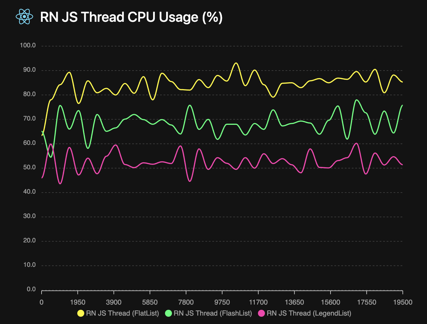
## It uses less resources
A FlashLight measurement of the above test shows that LegendList uses less CPU while scrolling. And it uses less memory too! See the [FlashLight results](/open-source/list/flashlight.html) for more details.
 ## Choose your platform
- **React Native** → [Getting Started (React Native)](../react-native/getting-started)
- **Web** → [Getting Started (Web)](../react/getting-started)
## What’s new in v3
- Web support (no React Native dependency required)
- SectionList component (`@legendapp/list/section-list`)
- `alwaysRender` for keeping selected items mounted
- New `maintainVisibleContentPosition` configuration
- `stickyHeaderIndices` (with `stickyIndices` deprecated)
Read the full change summary in [Migration to v3](../migration).
## performance
Legend List is very optimized by default, so it may already be working well without any configuration. But these are some common ways to improve your list behavior.
It's important to provide an `estimatedItemSize` (if items are the same size or all dynamic sizes) or `getEstimatedItemSize` (if items are different known sizes). Legend List uses this as the default item size, then as items are rendered it updates their positions with the actual size. So getting this estimate as close as possible to the real size will reduce layout shifting and blank spaces as items render. If not provided it will use `100px` as the default.
The `onItemSizeChanged` event can also help with your estimations - it will be called whenever an item's size changes. So you can use it to log what the actual rendered size is to adjust your estimates.
### Use `keyExtractor` Prop
```ts
keyExtractor?: (item: T, index: number) => string;
```
The `keyExtractor` prop lets Legend List save item layouts by key, so that if the `data` array changes it can reuse previous layout information and only update the changed items. Without `keyExtractor`, item sizes will reset to their default whenever `data` changes. So it is *very recommended* to have a `keyExtractor` if `data` ever changes. If your items are a fixed size, providing a `keyExtractor` that returns the index will tell it to reuse size information.
### Recycling List Items
```ts
recycleItems?: boolean // default: false
```
Legend List has an optional `recycleItems` prop which enables view recycling. This will reuse the component rendered by your `renderItem` function. This can be a big performance optimization because it does not need to destroy/create views while scrolling. But it also reuses any local state, which can cause some weird behavior that may not be desirable depending on your app. But see the [recycling hooks](../api#userecyclingstate) to make that easier.
So there are some tradeoffs with recycling:
- 👍 If you have items with no state then recycling should be great
- 👎 If you have simple items with complex state then it may be more trouble than it's worth
- 👍 If you have heavy items with complex state then working around the state recycling may be worth it for the performance gains
### Estimate Item Sizes
```ts
estimatedItemSize?: number;
getEstimatedItemSize?: (item: T, index: number, itemType?: string) => number;
getFixedItemSize?: (item: T, index: number, itemType?: string) => number | undefined;
onItemSizeChanged?: (info: {
size: number;
previous: number;
index: number;
itemKey: string;
itemData: ItemT;
}) => void;
```
If your list elements are a fixed size, then use `getFixedItemSize` to skip all of the work of measuring and adjusting items.
Providing accurate item size estimates helps determine the number of containers to allocate, based on screen size / estimatedItemSize. `estimatedItemSize` is used only for the first render, then Legend List switches to using the average of actually rendered item sizes. If you provide `getEstimatedItemSize`, it will use that function instead of averages. The more accurate your initial estimates, the better the first render experience.
Use `onItemSizeChanged` to log actual vs estimated sizes and improve your estimates over time. It's generally better to slightly underestimate than overestimate item sizes. Without estimates, Legend List defaults to 100px which will likely cause scrollbar jumping and layout issues.
### Keep Specific Items Mounted
```ts
alwaysRender?: { top?: number; bottom?: number; indices?: number[]; keys?: string[] };
```
Use `alwaysRender` to keep important items mounted even when they scroll out of view (e.g., pinned headers, chat sentinels). This slightly increases render work, so use it sparingly for the items that truly need to stay mounted.
### Set DrawDistance Prop
```ts
drawDistance?: number // default: 250
```
The `drawDistance` (defaults to `250`) is the buffer size in pixels above and below the viewport that will be rendered in advance. So for example if your screen is `2000px` tall and your draw distance is `1000`, then it will render double your screen size, from `-1000px` above the viewport to `1000px` below the viewport.
This can help reduce the amount of blank space while scrolling quickly. But if your items are computationally expensive, it may reduce performance because more items are rendering at once. So you should experiment with it to find the most optimal behavior for your app.
### Set `waitForInitialLayout` Prop
```ts
waitForInitialLayout?: boolean // default: true
```
If the size of your list items differs significantly from the estimate, you may see a layout jump after the first render. If so, the `waitForInitialLayout` prop solves that by delaying displaying list items by one frame so they start at the correct position. But, if you have fixed sized items then you may not want to disable it to avoid waiting a frame.
## react-native/getting-started
## Install
```npm
npm install @legendapp/list
```
## Usage
Legend List is a drop-in replacement for FlatList or FlashList. It only renders the items that are in view, which significantly reduces render cost for long lists.
### Quick Start
```jsx
import { Text } from "react-native";
import { LegendList } from "@legendapp/list/react-native";
const items = [
{ id: "1", title: "Item 1" },
{ id: "2", title: "Item 2" },
{ id: "3", title: "Item 3" },
];
export function MyList() {
return (
{item.title}}
keyExtractor={(item) => item.id}
recycleItems
/>
);
}
```
### Switch from FlashList
If you're coming from FlashList, in most cases you can just rename the component and it will work as expected. Legend List does not recycle items by default, so to match FlashList's behavior you can enable `recycleItems`.
```diff
return (
- {item.title}}
+ recycleItems
/>
)
```
### Switch from FlatList
Legend List should immediately be much faster. But you may want to add the `recycleItems` prop for extra performance.
```diff
return (
- {item.title}}
+ recycleItems
/>
)
```
See [API Reference](../../api) for all properties of LegendList.
## Supported Platforms
- Android
- iOS
- React Native MacOS
- React Native Windows
- TV platforms
- Any React Native platform should work since there's no native code, but if not please let us know!
## Community
Join us on [Discord](https://discord.gg/5CBaNtADNX) or [Github](https://github.com/LegendApp/legend-list) to get involved with the Legend community.
Talk to Jay on [Bluesky](https://bsky.app/profile/jayz.us) or [Twitter](https://twitter.com/jmeistrich).
## Contributing
We welcome contributions! Please read our [Contributing Guide](https://github.com/LegendApp/legend-list) on Github. And we welcome documentation PRs in our [documentation repo](https://github.com/LegendApp/legend-docs).
## Legend Kit
Legend Kit is our early but growing collection of high performance headless components, general purpose observables, transformer computeds, React hooks that don't re-render, and observable tools for popular frameworks. [Check out Legend Kit](https://www.legendapp.com/kit) to learn more.
## react-native/keyboard-and-animated
These integrations are React Native only. On web, use standard DOM animation libraries or CSS transitions.
## Reanimated
The Reanimated version of AnimatedLegendList supports animated props with Reanimated. Note that using `Animated.createAnimatedComponent` will not work as it needs more boilerplate, so you should use this instead.
Under the hood, these integrations use `Reanimated.ScrollView`.
In Reanimated 4, sticky headers can have performance problems. See Flickering/jittering while scrolling.
```jsx
import { useEffect } from "react";
import { AnimatedLegendList } from "@legendapp/list/reanimated";
import Animated, { useSharedValue, useAnimatedStyle, withSpring } from "react-native-reanimated";
export function ReanimatedExample() {
const scale = useSharedValue(0.8);
useEffect(() => {
scale.value = withSpring(1);
}, []);
return (
({
transform: [{ scale: scale.value }]
}))}
/>
);
}
```
### itemLayoutAnimation
Use `itemLayoutAnimation` to apply a Reanimated layout transition to list item containers.
```tsx
import { AnimatedLegendList } from "@legendapp/list/reanimated";
import { LinearTransition } from "react-native-reanimated";
export function ReanimatedLayoutTransitionExample() {
return (
item.id}
renderItem={renderItem}
/>
);
}
```
## Animated
AnimatedLegendList supports animated props with React Native's Animated.
```jsx
import { useEffect, useRef } from "react";
import { Animated } from "react-native";
import { AnimatedLegendList } from "@legendapp/list/animated";
export function AnimatedExample() {
const animated = useRef(new Animated.Value(0)).current;
useEffect(() => {
Animated.timing(animated, {
toValue: 1,
duration: 1000,
useNativeDriver: true,
}).start();
}, []);
return (
);
}
```
Note that this is just a wrapper around the normal `createAnimatedComponent` so you can use that if you prefer.
```ts
const AnimatedLegendList = Animated.createAnimatedComponent(LegendList);
```
## KeyboardAvoidingLegendList
Use `KeyboardAvoidingLegendList` from `@legendapp/list/keyboard` for smooth keyboard-aware scrolling and inset behavior.
An experimental entrypoint is also available at `@legendapp/list/keyboard-test`. It currently uses `KeyboardChatScrollView` and is likely to replace `@legendapp/list/keyboard` soon.
```ts
import { KeyboardAvoidingLegendList } from "@legendapp/list/keyboard-test";
```
This integration depends on `react-native-reanimated` and `react-native-keyboard-controller`.
```npm
npm install react-native-keyboard-controller
```
Do not wrap `KeyboardAvoidingLegendList` inside another `KeyboardAvoidingView`.
Let the list manage keyboard-aware behavior, and adjacent UI (like composers/inputs) should handle their own keyboard avoiding (for example with `KeyboardStickyView`).
If your app needs more advanced keyboard-avoidance behavior, use `KeyboardAvoidingLegendList` as a starting point and adapt it for your scenario. See the source: src/integrations/keyboard.tsx.
### Chat Example
```tsx
import { useState } from "react";
import { Button, TextInput, View } from "react-native";
import { KeyboardGestureArea, KeyboardProvider, KeyboardStickyView } from "react-native-keyboard-controller";
import { useAnimatedScrollHandler } from "react-native-reanimated";
import { useSafeAreaInsets } from "react-native-safe-area-context";
import { KeyboardAvoidingLegendList } from "@legendapp/list/keyboard";
export function KeyboardAvoidingExample() {
const [messages, setMessages] = useState(defaultChatMessages);
const [inputText, setInputText] = useState("");
const insets = useSafeAreaInsets();
const sendMessage = () => {
const text = inputText || "Empty message";
if (text.trim()) {
setMessages((messagesNew) => [
...messagesNew,
{ id: String(idCounter++), sender: "user", text: text, timeStamp: Date.now() },
]);
setInputText("");
}
};
const handleScroll = useAnimatedScrollHandler({
onScroll: (_event) => {},
});
return (
item.id}
maintainScrollAtEnd
maintainVisibleContentPosition
onScroll={handleScroll}
renderItem={ChatMessage}
safeAreaInsetBottom={insets.bottom}
style={styles.list}
/>
);
}
```
## react/examples
## Chat Playground
This demo combines the core behaviors needed for production chat feeds:
- `onStartReached` prepends older messages from the top
- `maintainVisibleContentPosition` keeps the viewport stable while prepending
- `initialScrollIndex` starts the feed at the latest messages
- `maintainScrollAtEndThreshold` controls bottom-follow behavior
- Sticky day boundaries are always enabled
## Horizontal Infinite Calendar
This demo shows a month-based calendar timeline with:
- horizontal scrolling
- 3 months visible at a time
- buttons for previous/next month and today
- true unbounded scrolling via recentering
## react/getting-started
## Install
```npm
npm install @legendapp/list
```
## Usage
Legend List is a drop-in replacement for virtualized lists in React. It only renders the items that are in view, which significantly reduces render cost for long lists.
On web, `renderItem` should return DOM elements (e.g. `div`). Your list needs a height, either directly or via a parent with a fixed height.
### Quick Start
```jsx
import { LegendList } from "@legendapp/list/react";
const items = [
{ id: "1", title: "Item 1" },
{ id: "2", title: "Item 2" },
{ id: "3", title: "Item 3" },
];
export function MyList() {
return (
## Choose your platform
- **React Native** → [Getting Started (React Native)](../react-native/getting-started)
- **Web** → [Getting Started (Web)](../react/getting-started)
## What’s new in v3
- Web support (no React Native dependency required)
- SectionList component (`@legendapp/list/section-list`)
- `alwaysRender` for keeping selected items mounted
- New `maintainVisibleContentPosition` configuration
- `stickyHeaderIndices` (with `stickyIndices` deprecated)
Read the full change summary in [Migration to v3](../migration).
## performance
Legend List is very optimized by default, so it may already be working well without any configuration. But these are some common ways to improve your list behavior.
It's important to provide an `estimatedItemSize` (if items are the same size or all dynamic sizes) or `getEstimatedItemSize` (if items are different known sizes). Legend List uses this as the default item size, then as items are rendered it updates their positions with the actual size. So getting this estimate as close as possible to the real size will reduce layout shifting and blank spaces as items render. If not provided it will use `100px` as the default.
The `onItemSizeChanged` event can also help with your estimations - it will be called whenever an item's size changes. So you can use it to log what the actual rendered size is to adjust your estimates.
### Use `keyExtractor` Prop
```ts
keyExtractor?: (item: T, index: number) => string;
```
The `keyExtractor` prop lets Legend List save item layouts by key, so that if the `data` array changes it can reuse previous layout information and only update the changed items. Without `keyExtractor`, item sizes will reset to their default whenever `data` changes. So it is *very recommended* to have a `keyExtractor` if `data` ever changes. If your items are a fixed size, providing a `keyExtractor` that returns the index will tell it to reuse size information.
### Recycling List Items
```ts
recycleItems?: boolean // default: false
```
Legend List has an optional `recycleItems` prop which enables view recycling. This will reuse the component rendered by your `renderItem` function. This can be a big performance optimization because it does not need to destroy/create views while scrolling. But it also reuses any local state, which can cause some weird behavior that may not be desirable depending on your app. But see the [recycling hooks](../api#userecyclingstate) to make that easier.
So there are some tradeoffs with recycling:
- 👍 If you have items with no state then recycling should be great
- 👎 If you have simple items with complex state then it may be more trouble than it's worth
- 👍 If you have heavy items with complex state then working around the state recycling may be worth it for the performance gains
### Estimate Item Sizes
```ts
estimatedItemSize?: number;
getEstimatedItemSize?: (item: T, index: number, itemType?: string) => number;
getFixedItemSize?: (item: T, index: number, itemType?: string) => number | undefined;
onItemSizeChanged?: (info: {
size: number;
previous: number;
index: number;
itemKey: string;
itemData: ItemT;
}) => void;
```
If your list elements are a fixed size, then use `getFixedItemSize` to skip all of the work of measuring and adjusting items.
Providing accurate item size estimates helps determine the number of containers to allocate, based on screen size / estimatedItemSize. `estimatedItemSize` is used only for the first render, then Legend List switches to using the average of actually rendered item sizes. If you provide `getEstimatedItemSize`, it will use that function instead of averages. The more accurate your initial estimates, the better the first render experience.
Use `onItemSizeChanged` to log actual vs estimated sizes and improve your estimates over time. It's generally better to slightly underestimate than overestimate item sizes. Without estimates, Legend List defaults to 100px which will likely cause scrollbar jumping and layout issues.
### Keep Specific Items Mounted
```ts
alwaysRender?: { top?: number; bottom?: number; indices?: number[]; keys?: string[] };
```
Use `alwaysRender` to keep important items mounted even when they scroll out of view (e.g., pinned headers, chat sentinels). This slightly increases render work, so use it sparingly for the items that truly need to stay mounted.
### Set DrawDistance Prop
```ts
drawDistance?: number // default: 250
```
The `drawDistance` (defaults to `250`) is the buffer size in pixels above and below the viewport that will be rendered in advance. So for example if your screen is `2000px` tall and your draw distance is `1000`, then it will render double your screen size, from `-1000px` above the viewport to `1000px` below the viewport.
This can help reduce the amount of blank space while scrolling quickly. But if your items are computationally expensive, it may reduce performance because more items are rendering at once. So you should experiment with it to find the most optimal behavior for your app.
### Set `waitForInitialLayout` Prop
```ts
waitForInitialLayout?: boolean // default: true
```
If the size of your list items differs significantly from the estimate, you may see a layout jump after the first render. If so, the `waitForInitialLayout` prop solves that by delaying displaying list items by one frame so they start at the correct position. But, if you have fixed sized items then you may not want to disable it to avoid waiting a frame.
## react-native/getting-started
## Install
```npm
npm install @legendapp/list
```
## Usage
Legend List is a drop-in replacement for FlatList or FlashList. It only renders the items that are in view, which significantly reduces render cost for long lists.
### Quick Start
```jsx
import { Text } from "react-native";
import { LegendList } from "@legendapp/list/react-native";
const items = [
{ id: "1", title: "Item 1" },
{ id: "2", title: "Item 2" },
{ id: "3", title: "Item 3" },
];
export function MyList() {
return (
{item.title}}
keyExtractor={(item) => item.id}
recycleItems
/>
);
}
```
### Switch from FlashList
If you're coming from FlashList, in most cases you can just rename the component and it will work as expected. Legend List does not recycle items by default, so to match FlashList's behavior you can enable `recycleItems`.
```diff
return (
- {item.title}}
+ recycleItems
/>
)
```
### Switch from FlatList
Legend List should immediately be much faster. But you may want to add the `recycleItems` prop for extra performance.
```diff
return (
- {item.title}}
+ recycleItems
/>
)
```
See [API Reference](../../api) for all properties of LegendList.
## Supported Platforms
- Android
- iOS
- React Native MacOS
- React Native Windows
- TV platforms
- Any React Native platform should work since there's no native code, but if not please let us know!
## Community
Join us on [Discord](https://discord.gg/5CBaNtADNX) or [Github](https://github.com/LegendApp/legend-list) to get involved with the Legend community.
Talk to Jay on [Bluesky](https://bsky.app/profile/jayz.us) or [Twitter](https://twitter.com/jmeistrich).
## Contributing
We welcome contributions! Please read our [Contributing Guide](https://github.com/LegendApp/legend-list) on Github. And we welcome documentation PRs in our [documentation repo](https://github.com/LegendApp/legend-docs).
## Legend Kit
Legend Kit is our early but growing collection of high performance headless components, general purpose observables, transformer computeds, React hooks that don't re-render, and observable tools for popular frameworks. [Check out Legend Kit](https://www.legendapp.com/kit) to learn more.
## react-native/keyboard-and-animated
These integrations are React Native only. On web, use standard DOM animation libraries or CSS transitions.
## Reanimated
The Reanimated version of AnimatedLegendList supports animated props with Reanimated. Note that using `Animated.createAnimatedComponent` will not work as it needs more boilerplate, so you should use this instead.
Under the hood, these integrations use `Reanimated.ScrollView`.
In Reanimated 4, sticky headers can have performance problems. See Flickering/jittering while scrolling.
```jsx
import { useEffect } from "react";
import { AnimatedLegendList } from "@legendapp/list/reanimated";
import Animated, { useSharedValue, useAnimatedStyle, withSpring } from "react-native-reanimated";
export function ReanimatedExample() {
const scale = useSharedValue(0.8);
useEffect(() => {
scale.value = withSpring(1);
}, []);
return (
({
transform: [{ scale: scale.value }]
}))}
/>
);
}
```
### itemLayoutAnimation
Use `itemLayoutAnimation` to apply a Reanimated layout transition to list item containers.
```tsx
import { AnimatedLegendList } from "@legendapp/list/reanimated";
import { LinearTransition } from "react-native-reanimated";
export function ReanimatedLayoutTransitionExample() {
return (
item.id}
renderItem={renderItem}
/>
);
}
```
## Animated
AnimatedLegendList supports animated props with React Native's Animated.
```jsx
import { useEffect, useRef } from "react";
import { Animated } from "react-native";
import { AnimatedLegendList } from "@legendapp/list/animated";
export function AnimatedExample() {
const animated = useRef(new Animated.Value(0)).current;
useEffect(() => {
Animated.timing(animated, {
toValue: 1,
duration: 1000,
useNativeDriver: true,
}).start();
}, []);
return (
);
}
```
Note that this is just a wrapper around the normal `createAnimatedComponent` so you can use that if you prefer.
```ts
const AnimatedLegendList = Animated.createAnimatedComponent(LegendList);
```
## KeyboardAvoidingLegendList
Use `KeyboardAvoidingLegendList` from `@legendapp/list/keyboard` for smooth keyboard-aware scrolling and inset behavior.
An experimental entrypoint is also available at `@legendapp/list/keyboard-test`. It currently uses `KeyboardChatScrollView` and is likely to replace `@legendapp/list/keyboard` soon.
```ts
import { KeyboardAvoidingLegendList } from "@legendapp/list/keyboard-test";
```
This integration depends on `react-native-reanimated` and `react-native-keyboard-controller`.
```npm
npm install react-native-keyboard-controller
```
Do not wrap `KeyboardAvoidingLegendList` inside another `KeyboardAvoidingView`.
Let the list manage keyboard-aware behavior, and adjacent UI (like composers/inputs) should handle their own keyboard avoiding (for example with `KeyboardStickyView`).
If your app needs more advanced keyboard-avoidance behavior, use `KeyboardAvoidingLegendList` as a starting point and adapt it for your scenario. See the source: src/integrations/keyboard.tsx.
### Chat Example
```tsx
import { useState } from "react";
import { Button, TextInput, View } from "react-native";
import { KeyboardGestureArea, KeyboardProvider, KeyboardStickyView } from "react-native-keyboard-controller";
import { useAnimatedScrollHandler } from "react-native-reanimated";
import { useSafeAreaInsets } from "react-native-safe-area-context";
import { KeyboardAvoidingLegendList } from "@legendapp/list/keyboard";
export function KeyboardAvoidingExample() {
const [messages, setMessages] = useState(defaultChatMessages);
const [inputText, setInputText] = useState("");
const insets = useSafeAreaInsets();
const sendMessage = () => {
const text = inputText || "Empty message";
if (text.trim()) {
setMessages((messagesNew) => [
...messagesNew,
{ id: String(idCounter++), sender: "user", text: text, timeStamp: Date.now() },
]);
setInputText("");
}
};
const handleScroll = useAnimatedScrollHandler({
onScroll: (_event) => {},
});
return (
item.id}
maintainScrollAtEnd
maintainVisibleContentPosition
onScroll={handleScroll}
renderItem={ChatMessage}
safeAreaInsetBottom={insets.bottom}
style={styles.list}
/>
);
}
```
## react/examples
## Chat Playground
This demo combines the core behaviors needed for production chat feeds:
- `onStartReached` prepends older messages from the top
- `maintainVisibleContentPosition` keeps the viewport stable while prepending
- `initialScrollIndex` starts the feed at the latest messages
- `maintainScrollAtEndThreshold` controls bottom-follow behavior
- Sticky day boundaries are always enabled
## Horizontal Infinite Calendar
This demo shows a month-based calendar timeline with:
- horizontal scrolling
- 3 months visible at a time
- buttons for previous/next month and today
- true unbounded scrolling via recentering
## react/getting-started
## Install
```npm
npm install @legendapp/list
```
## Usage
Legend List is a drop-in replacement for virtualized lists in React. It only renders the items that are in view, which significantly reduces render cost for long lists.
On web, `renderItem` should return DOM elements (e.g. `div`). Your list needs a height, either directly or via a parent with a fixed height.
### Quick Start
```jsx
import { LegendList } from "@legendapp/list/react";
const items = [
{ id: "1", title: "Item 1" },
{ id: "2", title: "Item 2" },
{ id: "3", title: "Item 3" },
];
export function MyList() {
return (
(
{item.title}
)}
keyExtractor={(item) => item.id}
recycleItems
style={{ height: "100%" }}
/>
);
}
```
### Window Scroll Pages
If your page already scrolls at the window level (instead of a fixed-height list container), set `useWindowScroll`.
```jsx
item.id}
renderItem={renderItem}
useWindowScroll
/>
```
### Important layout notes
- The scroll container must have a height (unless you use `useWindowScroll`). Use a fixed height, or a flex parent with a set height.
- `style` and `contentContainerStyle` accept CSS properties on web.
- If you are rendering inside a flex layout, be sure the list can actually shrink (e.g. `minHeight: 0` on the parent).
See [API Reference](../../api) for all properties of LegendList.
## Supported Platforms
- Chrome
- Safari
- Firefox
- Edge
- Any modern browser with current React support
## Community
Join us on [Discord](https://discord.gg/5CBaNtADNX) or [Github](https://github.com/LegendApp/legend-list) to get involved with the Legend community.
Talk to Jay on [Bluesky](https://bsky.app/profile/jayz.us) or [Twitter](https://twitter.com/jmeistrich).
## Contributing
We welcome contributions! Please read our [Contributing Guide](https://github.com/LegendApp/legend-list) on Github. And we welcome documentation PRs in our [documentation repo](https://github.com/LegendApp/legend-docs).
## Legend Kit
Legend Kit is our early but growing collection of high performance headless components, general purpose observables, transformer computeds, React hooks that don't re-render, and observable tools for popular frameworks. [Check out Legend Kit](https://www.legendapp.com/kit) to learn more.